About once a month, most people living with a uterus deal with the shedding of inner uterine lining — more simply, a period. Managing a period entails the use of menstrual products, and while product options range far and wide, most name brands have one thing in common: packaging.
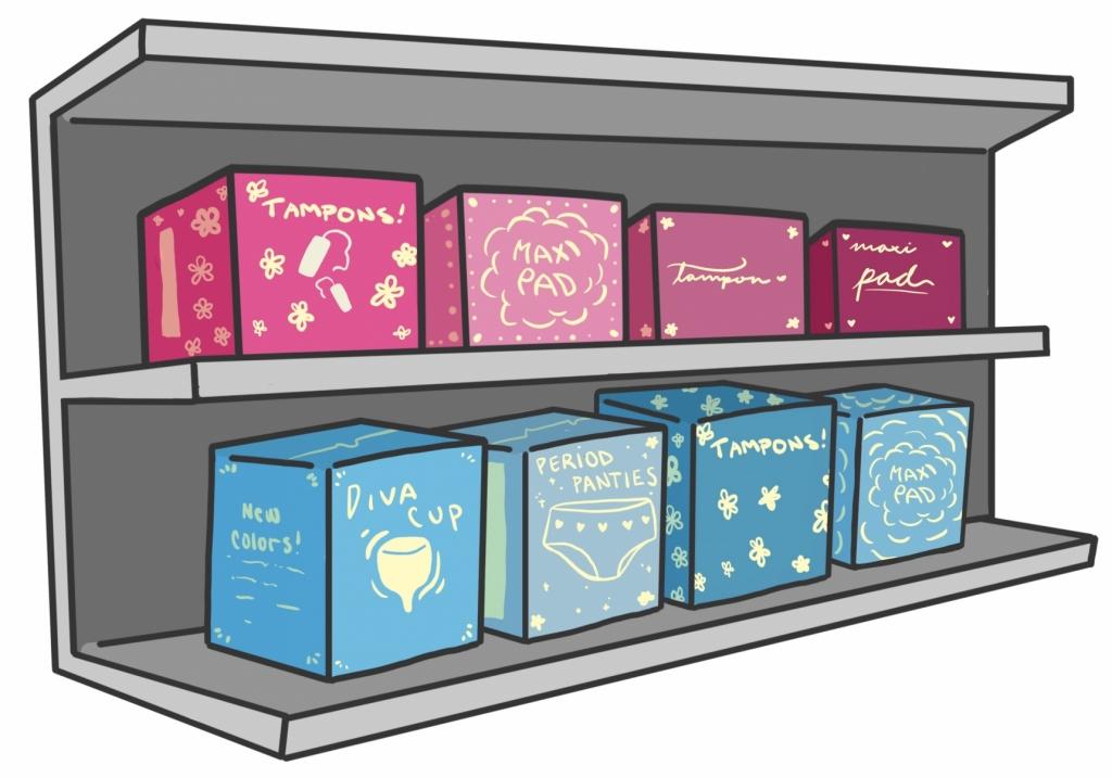
Menstrual product packaging features just about every feminine cliche there is. From splashes of pink or purple, to flowers and polka dots, to curling cursive logos, the branding is glaringly stereotypical. While they don’t perpetuate taboos surrounding periods, the packaging is still demeaning, non-inclusive and excessive.
Traveling through the menstrual product section of a typical drug store is like getting smacked in the face by every ultra feminine trope ever. Everything is bright, obnoxiously cheerful, usually pink and has some kind of flower or twinkle. It’s childish, which is quite nonsensical when considering that a majority of the consumer market for menstrual products is adults. How are people not supposed to feel patronized when shopping for period products if they’re staring down shelves of fluff reminiscent of their childhoods? Consumers are put in this demeaning box of gender stereotypes that keeps menstruation in a constant limbo between taboo and normality.
With so many people, regardless of gender identity, dealing with periods, menstruation needs to be normalized.
Story continues below advertisement
This packaging is not only patronizing — it’s also non-inclusive. Plenty of people who deal with a menstrual cycle don’t identify as female. Everything from the use of the term “feminine products” over “menstrual products” to gender-stereotyped branding excludes those that manage a period but don’t identify as female. Why is it necessary for a pad wrapper to feature the female gender symbol? How is that forward thinking considering the people who are ostracized and alienated by the aggressively gendered product packaging?
With so many people dealing with periods, menstruation needs to be normalized. The weird “You go, girl!” energy that comes with current packaging, the woman stealthily sliding you a tampon with a smile and a wink, that sort of “It’s nothing to be embarrassed about but absolutely don’t talk about it” ideology doesn’t promote forward thinking in any way. It perpetuates the idea that a period is something dramatic, traumatic or even unusual.
Part of this branding issue lies in the names of the products themselves. The biggest brand in menstrual cups is called DivaCup. The definition of the word “diva” is “a self-important person who is temperamental and difficult to please (typically used of a woman.)” DivaCup is a company that produces a menstrual product while perpetuating one of the biggest stigmas those who menstruate face: being “period crazy.” The idea that women on their periods are out of control, hormonal messes is so far from the truth it’s laughable. Every day you probably encounter or interact with someone on their period, and unless they told you so, you would have no clue. This is because — and this may be shocking to some — periods are normal to those who deal with them.
When looking at more progressive companies trying to create change within the period product industry, there are a few things that stand out. The packaging itself is much more approachable, and the values that the companies stand for are also admirable. Brands like Lola and Rael are run by women and are focused on quality products that are better for our bodies. By supporting companies focused on the well-being of their customers while normalizing periods through low key packaging, change is, indeed, possible.
Periods are normal, and if periods are normal, menstrual product packaging can be too.


